


Sig of the Week #2
4 posters

Which one?
Sig of the Week #2
![]() Zomb Sun Jun 13, 2010 11:26 pm
Zomb Sun Jun 13, 2010 11:26 pm
Theme: Female Render
Date ending: 18/6 midnight (EST)
Poll closing: 20/6 midnight (EST)
Size max: 500 x 200 px
Size min: 200 x 100 px or 100 x 200
Misc rules:
-Sig must be made during the open time of the contest *on the honor system for the most part*
-1 entry per person
-Max file size: 1mb (pretty much only applies to animated entries so as to not enter ridiculously large images that would bog down some computers.)
-Winner picks the theme of the next SotW (special circumstances may apply such as holidays)
*Winner has untill midnight of the following day after the poll ends to submit the new theme to ensure enough time is given*
-Provide viable reasons with your vote when the voting starts or it won't count. (An attempt to keep down fanboying the character. Viable reasons are reasons pertaining to the composition of the sig not just the render. Being innovative when fitting a theme can also be a viable reason.)
-Avoid voting for yourself and if you entered something try to cast a vote to be 'fair'
Dwlr

Zomb

Ferret
Date ending: 18/6 midnight (EST)
Poll closing: 20/6 midnight (EST)
Size max: 500 x 200 px
Size min: 200 x 100 px or 100 x 200
Misc rules:
-Sig must be made during the open time of the contest *on the honor system for the most part*
-1 entry per person
-Max file size: 1mb (pretty much only applies to animated entries so as to not enter ridiculously large images that would bog down some computers.)
-Winner picks the theme of the next SotW (special circumstances may apply such as holidays)
*Winner has untill midnight of the following day after the poll ends to submit the new theme to ensure enough time is given*
-Provide viable reasons with your vote when the voting starts or it won't count. (An attempt to keep down fanboying the character. Viable reasons are reasons pertaining to the composition of the sig not just the render. Being innovative when fitting a theme can also be a viable reason.)
-Avoid voting for yourself and if you entered something try to cast a vote to be 'fair'
Dwlr
Zomb
Ferret
Last edited by Zomb on Sat Jun 19, 2010 12:28 am; edited 1 time in total

Zomb- Admin
- Awards :


Posts : 114
Join date : 2010-04-26
Re: Sig of the Week #2
![]() Zomb Sat Jun 19, 2010 12:30 am
Zomb Sat Jun 19, 2010 12:30 am
Poll is up, vote away.
I'm voting for Dwlr.
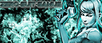
Although Ferret's sig shows improvement from last week the monochrome seems to lack something.
Dwlr's sig makes her look like she is in some kind of aura or something and it really draws out the character from the background without sacrificing blending.
I'm voting for Dwlr.
Although Ferret's sig shows improvement from last week the monochrome seems to lack something.
Dwlr's sig makes her look like she is in some kind of aura or something and it really draws out the character from the background without sacrificing blending.
Last edited by Zomb on Sat Jun 19, 2010 9:54 pm; edited 1 time in total
Zomb- Admin
- Awards :
Posts : 114
Join date : 2010-04-26
Re: Sig of the Week #2
![]() Dwlr Sat Jun 19, 2010 12:52 am
Dwlr Sat Jun 19, 2010 12:52 am
Voting for Zombie, the lightning makes it look flat, but it's more a comparative thing this week not saying they're bad or anything just that niether of them really 'pop' this week. Ferret's monochrome color is fine but the render is over sharpened at that issue with the focal kills it for me.
ZomB - Burn and Dodge tool are your friends this week, they'd help add some depth for ya.
Ferret - Monochrome sigs have the unique advantage to use a stroke outline around the render without killing blending, it can help change the cluttered feel that they usually end up getting so maybe experiment with that a tad. Also since you're not worried about color the focus should be on what quality the render looks to you and really make sure that it's good quality since that is what is going to make them stand-out for the better, but over sharpened renders on a monochrome just makes it look like a disaster area. ^^;

Dwlr- Admin
- Awards :

Badges :

Posts : 62
Join date : 2010-04-26
Location : The great state of Apathy. -

Re: Sig of the Week #2
![]() Ice Sun Jun 20, 2010 8:55 pm
Ice Sun Jun 20, 2010 8:55 pm
I voted for dwlr sig its blend is nice and i like the feeling from the lighting it works well togather looks nice keep of the awesome work.

Ice- Awards :

Posts : 3
Join date : 2010-06-19

Ferret- Awards :
Posts : 34
Join date : 2010-06-07
» Sig of the week 3
» Sig of the Week 4
» Sig of the Week 13
» Sig of the Week 6 (Dio)
» Sig of the Week 7
» Sig of the Week 4
» Sig of the Week 13
» Sig of the Week 6 (Dio)
» Sig of the Week 7
Permissions in this forum:
You cannot reply to topics in this forum|
|
|